
“Oh I exercise control in all things, Ms. [Sherwin Williams].”
As I wander the halls of the hospital I am reminded of the fickle habits of humans. I have a unique ability to determine the last time a hospital was renovated by looking at its random architectural features for a few seconds. The beige era began and closed out the taupe age around 2007. And then every hospital began turning a variant of “Investor Tan” starting most often in the ED (or ER for you civilian folks).

Walking though this khaki collective that is yet another hospital desperate for fresh paint I find my mind wandering as it is prone to do. “Who had this idea? Was it one person who convinced everyone else it was a great idea? Was there science behind it? I can say with certainty that beige does not soothe me. Was it some weird corporate concoction? Was the country just really short on grey/black tint but overstocked on gold?”
I like to think he/she/they was/were the precursor to what we now call an influencer who caught the last vestige of Boomer social décor dominance in society. They named a boring-ass beige color “Tuscan Twilight” or “The Warmth of Crema” and proceeded to add white and brown accent colors to a palette card for the paint stores to pimp.

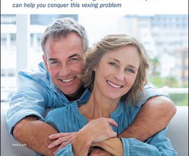
They arranged photos of various groups intentionally selected to appear both diverse and happy. Lots of white sweaters, button-up flannels or oxfords with the sleeves rolled up, and smiles so white just looking at them slams your irises shut.

Pictures that subliminally say “look how well-adjusted and happy we are in our serene terrene.” You know the shot. It’s the one where you have to wait till the end to figure out if they are selling a reverse mortgage, credit union membership, flaccid penis pills, or life insurance for nanna while she can still pass a physical.
If I didn’t know better I would think using Softer Tan or Impressive Ivory will lighten my teeth. ‘Don’t change you, change what’s around you!’
Sorry for that tangent. But to me these trends are absurd. Purple tells me it was the 1990s. Mildly-warm greys and cool whites tells me it was the last 5 years. Browns tells me 1970s. Plum or peach tells me 1980s. Pink tells me it’s just a dated OB ward* (I’ll come back to this in another post). But in every case the theme is consistent; as a species we really struggle with regional or sectoral industrial identity independence. We suck at it, actually.
Tangent 2
I once interviewed with a hospital system on the Atlantic coast in Rhode Island. They served actual lobster every Tuesday. To patients, the public, the staff, they served beautiful lobster tables. Why? Because in this fishing town lobster was everywhere like beef is in Nebraska. And being a land-raised man by upbringing who loves lobster, I was like, “is this heaven?” Now THAT is some regional identity! But of course the hallways were painted Believable Buff.

We want to show our independence and highlight ways we are unique in this life (queue local sports team). I know a LOT about this one. Born and raised in St. Louis and transplanted to Philadelphia- these cities live and breathe their independence. But they all painted their hospital hallways beige in the aughts. I know because I was there for the painting of the former and I’m currently trying to repaint the latter. For colors these days I am focusing on brand identity. While I do inject some individuality based on the facility I am also pretty color blind so I avoid getting too radical. But I also don’t want to look like everybody else. Blech. How boring.
“I don’t think I’d fit in here. Look at me.” -Anastasia Steele:
Tangent 3
I’m not trying to sell myself as a rabid nonconformist. There are definitely times I want to fit in. But it is much less at my age than it once was. I am often frustrated at my generation’s seeming desperation to package conformity or uniformity as the only way to be considered worthy. That need to blend can be internalized. Think of the “be all you can be” slogan the Army used to rock. Then as generations started shifting toward individuality they too switched with the slogan “an army of one.” Considering the way my kids’ generation is that slogan will soon be “I don’t give a fuck about your stripes, my stars sparkle.” I say that with a knowing grin of affection for their nonconformity. I was never that brave.

But I also can’t abide that ☝ shite. In the humble opinion of this socially-stunted engineer, it is time to let the institution reflect the population. Stop trying to make everything look the damned same. We have been doing this going on 60 years and all we are doing is erasing the differences that make traveling worthwhile.

I recognize my privilege here. I am in a financial position to choose where I live (mostly). But I am not really advocating for myself. If I can’t buy it I assure you I can build it. But I am advocating for those that can’t. Those that don’t have the money or the skills or inclination. Basically, let’s stop boxing humans up in the cheapest or most generic trend we can find. Yes artisan and craftsman work is more expensive. But it doesn’t take much to give our lives some individuality.
Multiple-Tangent Conclusion
Okay, I know that moved around a lot. But in all reality there are a lot of connections. I hope to do some actual academic research on this topic and come back for a follow-up piece with cooler words. Bottom line; be your true self. Be unique. Ditch the Uggz, paint over the beige with something that pops (just no wallpaper!), and admit that pumpkin spice is kinda gross. Take a stand for something today and never accept mediocrity. You are a cool carbon unit and I want to hear your ideas.
Until then, love each other and have a good night.
